A brand that feels like you
Colours, type, a logo and the kit that shows you how to use them, decided with you.
What branding covers
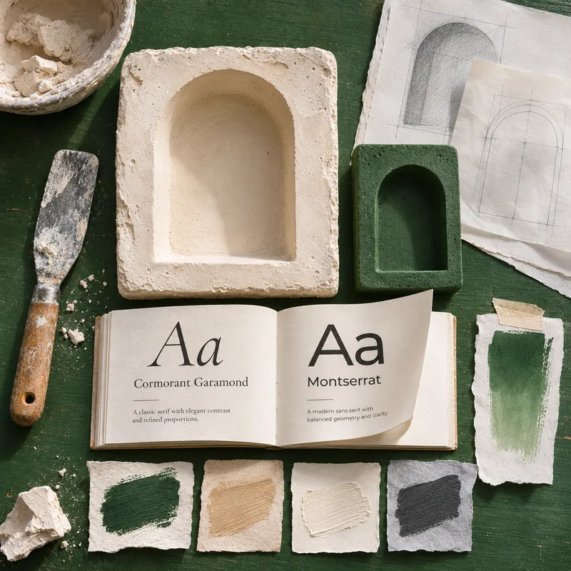
A brand is a small set of decisions. Made well and used the same way everywhere, they make everything you put out look like it came from one place. Those decisions are made with you, and you leave with a kit to use every day.
- Colours: a palette that works together, with the codes to match it everywhere.
- Typography: fonts paired for headings and for reading.
- Logo: a mark in the versions and files you need.
Finished kits
A branding kit gathers every decision in one long page. These are finished kits, shown small enough to compare side by side.
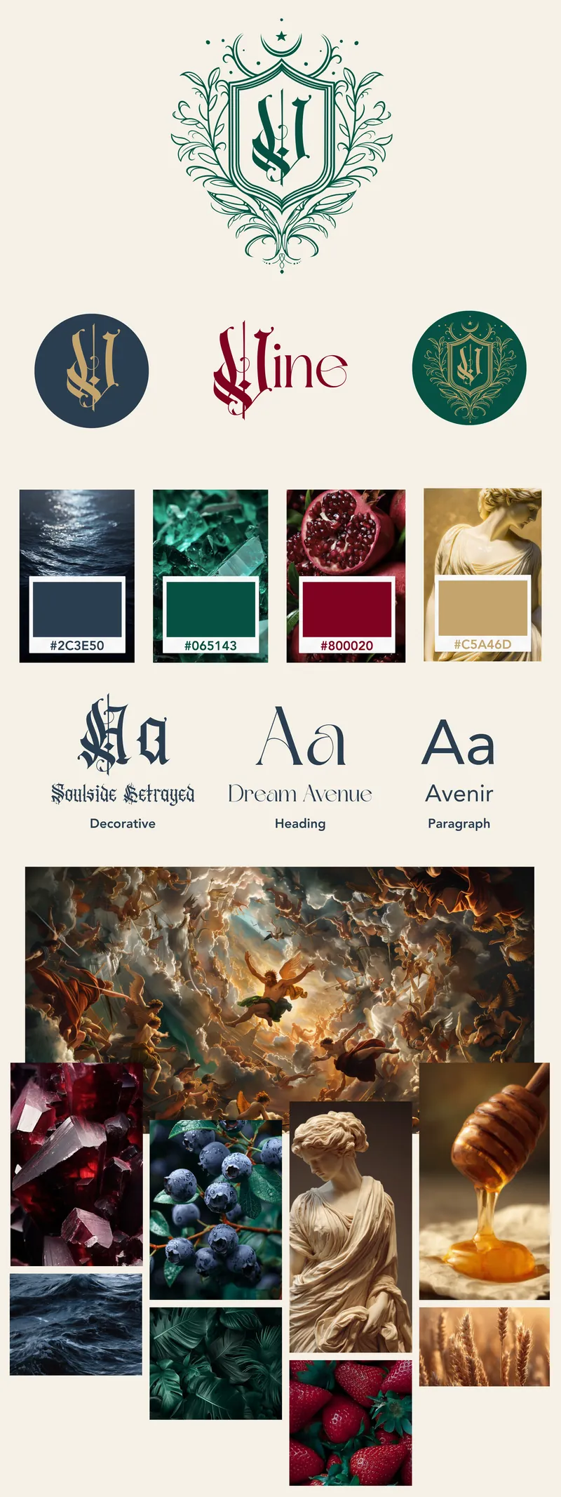
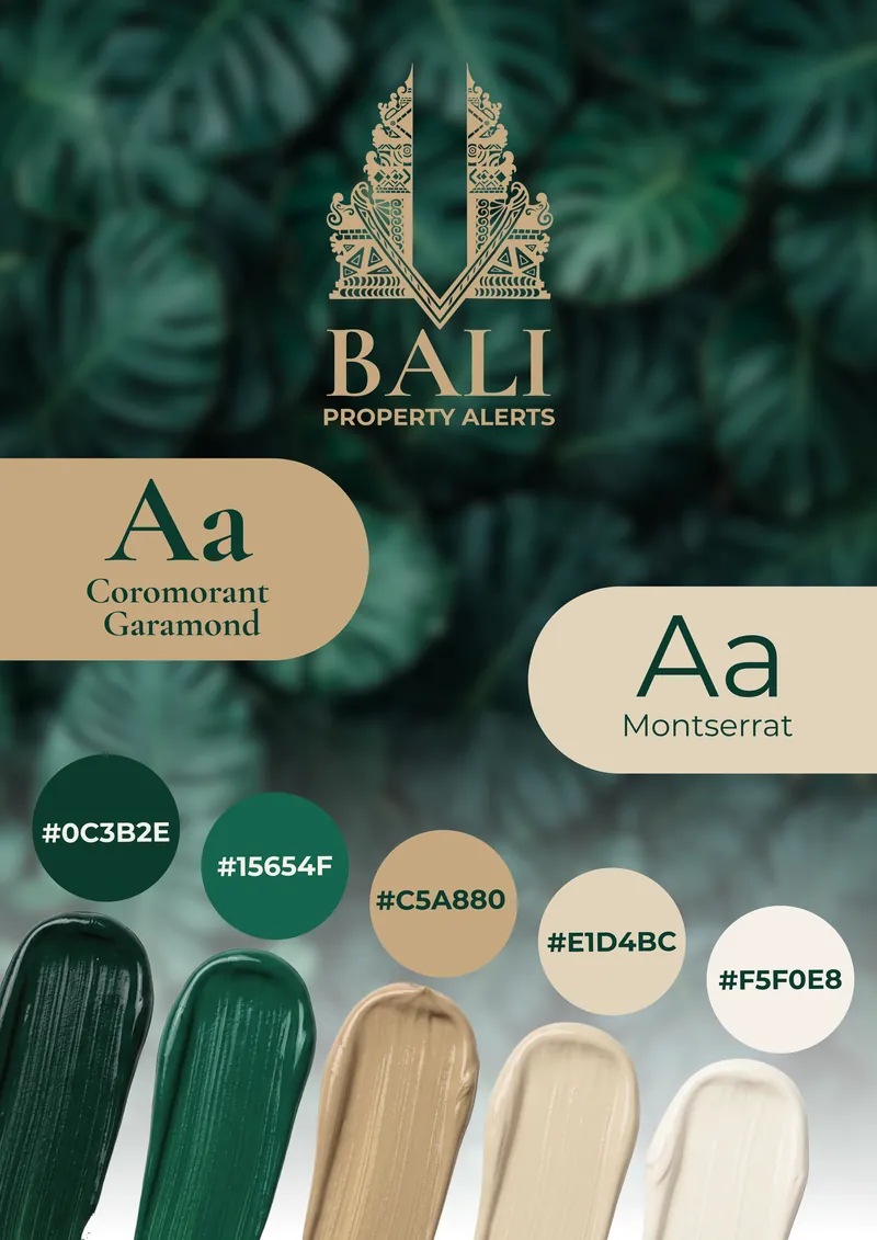
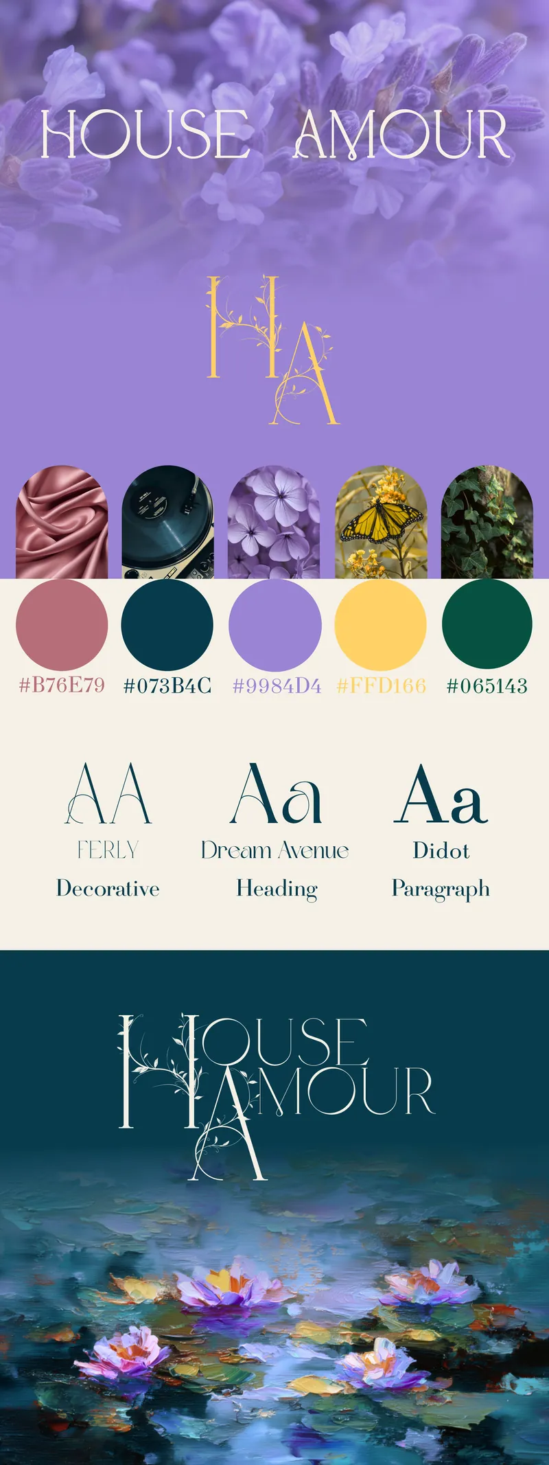
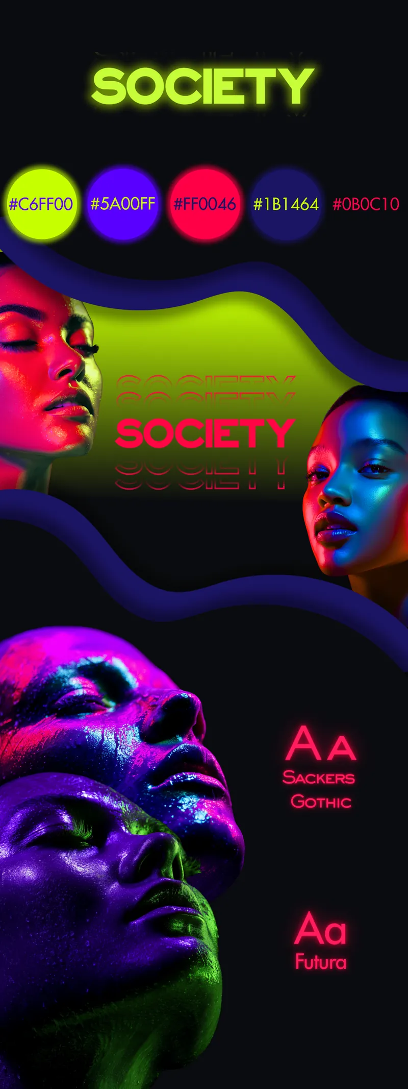
Each example shows a finished look. What you receive is set by the option you choose below.
Options and prices
Choose the colours and typography, the logo, or the full kit. Prices are in Australian dollars.
Colours and typography
Your palette and fonts, set out in a kit you can use every day.
- Palette and font pairing
- Brand kit document
- Your name set in your chosen colours and fonts
- Matching background image
- Mood board, delivered as a branded PDF
- Written description of the look
- All your colour codes
- 1 round of changes
Logo
A logo agreed with you, ready for your website and for print.
- Main logo and compact logo
- Colour and single-colour versions
- Files for web and print
- 1 round of changes
The full kit
Colours, type and logo, made to work together.
- Everything in Colours and typography
- Everything in Logo
- 1 round of changes
Add to any option
- Branding variations, $200. Extra creative directions within the agreed brief. The number is agreed in your quote.
- Extra rounds of changes, $100 each. Every option includes 1 round.
- Merchandise and print. Quoted individually, with the supplier cost and handling margin agreed before ordering.
A few principles
Good branding is made of choices you can explain. These are the ones that come up most.
- Start from one colour. The rest are chosen to sit with it: neighbours on the colour wheel, a contrasting partner, or the same colour in lighter and darker depths.
- Keep the palette small. A main colour, a second colour and an accent, in roughly a 60, 30 and 10 split, is easy to recognise and easy to use well.
- Pair type with a purpose. One font for headings and a quieter one for reading, chosen to look clearly different from each other and to stay legible where people will read.
- Give the logo room. Set a clear space around it and a smallest size, so it stays sharp wherever it appears.
Then write all of it down, so the brand looks the same every time.
Branding in use
Shape your brand
Tell us about your business and who you want to reach, and the brand will be shaped around it.